Summary
This initiative aimed to increase the CVR and the average session per user as well as decrease the time to ask a new question for Brainly tutoring subscribers.
The challenge of this initiative laid in streamlining the process without being too abrupt at the same time.
It was crucial that users could immediately see the benefits of a simpler and faster experience without feeling disoriented by unfamiliar changes.
It was crucial that users could immediately see the benefits of a simpler and faster experience without feeling disoriented by unfamiliar changes.
Company • Brainly - Ed-tech
Role • Senior Interaction Product Designer
Timeline • 2022 - Q4
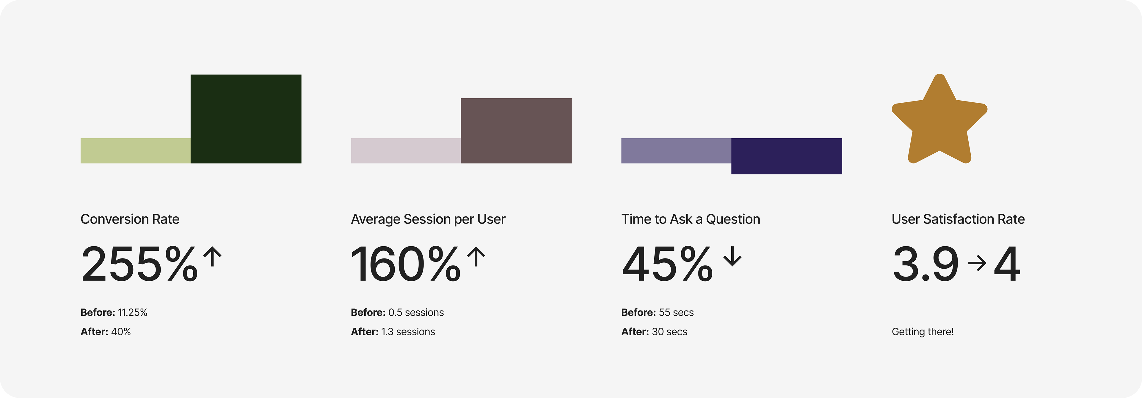
Metrics and Impact
Results gathered in this project
Context and problem to be solved
1. Company overview
Brainly is an Ed-Tech platform that leverages a peer-to-peer learning model to help students with their academic questions.
Among other products, It also offers Tutoring, a premium service where students can connect with tutors in 1:1 sessions.
Among other products, It also offers Tutoring, a premium service where students can connect with tutors in 1:1 sessions.
2. What we were trying to solve
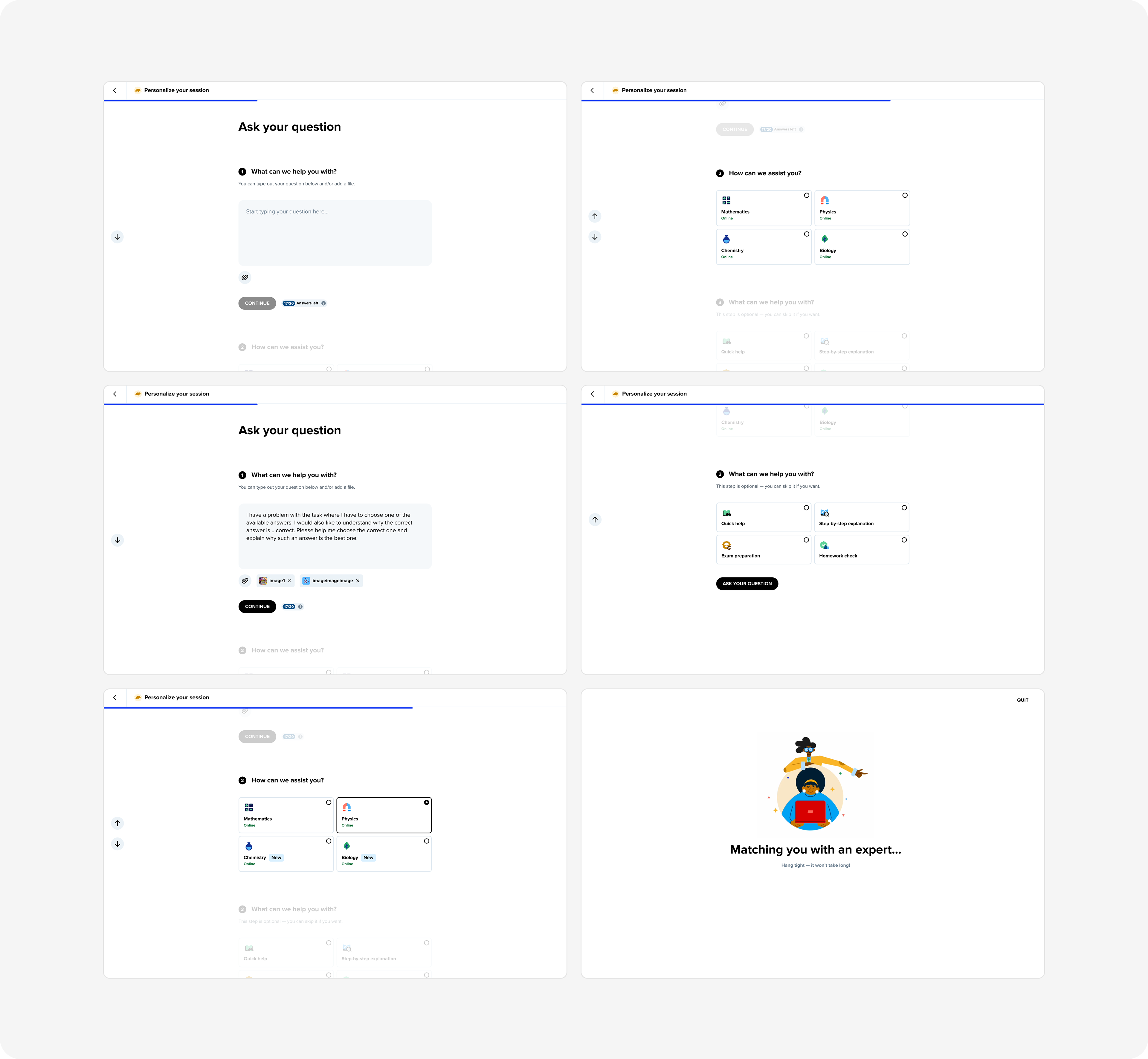
Our goal was to make the process of asking a new question, simpler and faster for Brainly Tutoring students. We observed that many paying users did not use our product even once.
Users frequently began the process of asking a question but did not complete it. While qualitative data (previous interviews) indicated that the process was complex, it did not explain the underlying reasons.
Users frequently began the process of asking a question but did not complete it. While qualitative data (previous interviews) indicated that the process was complex, it did not explain the underlying reasons.
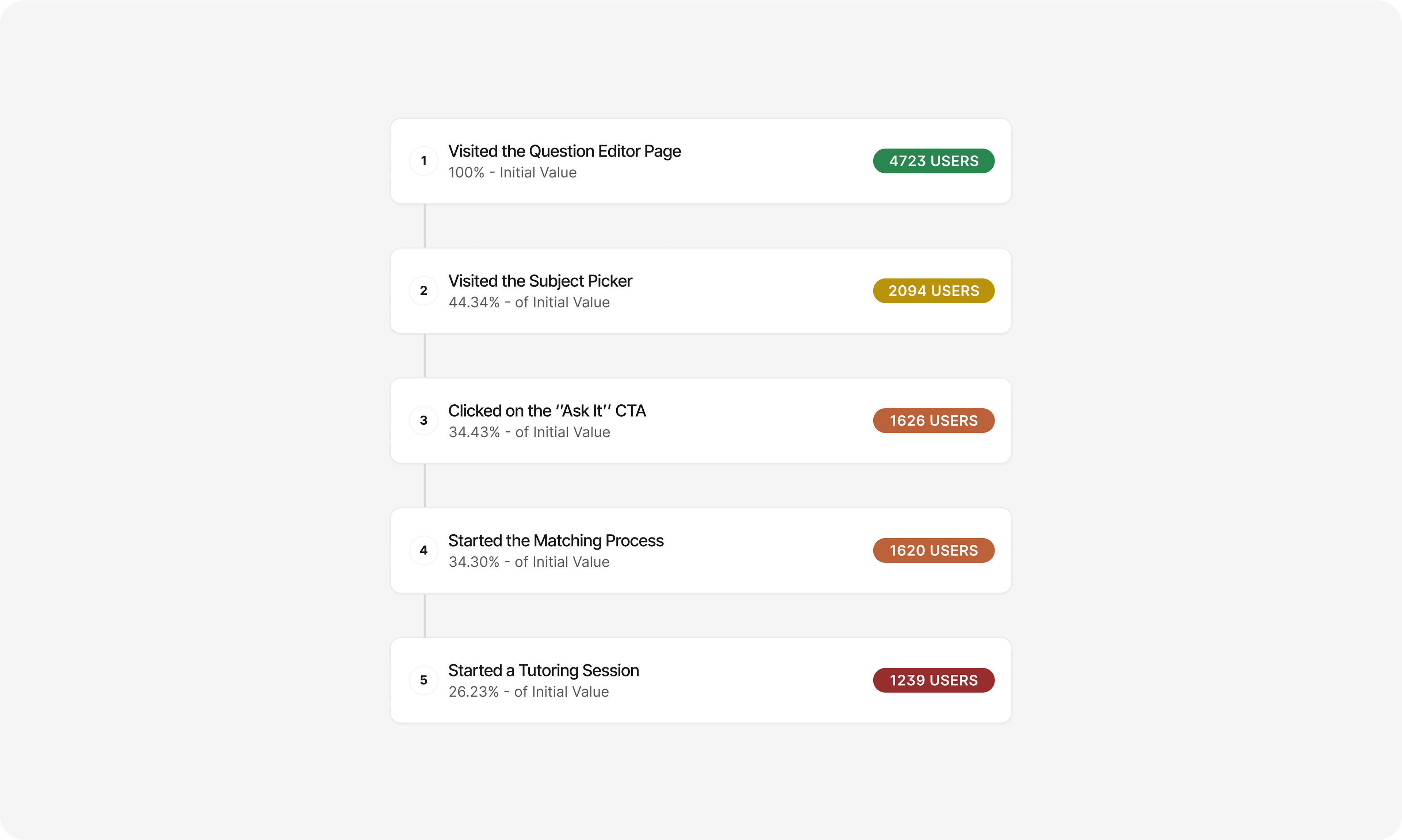
3. Let’s take a closer look
To illustrate the problem, let’s look on the number coming from our mobile users (US Market - iOS devices). Only 26% of those premium paying users started a Tutoring session with us.
Objectives - What we set out to improve
1. Conversion rate
2. Average sessions per user
3. Time to ask a question
4. User satisfaction rate
2. Average sessions per user
3. Time to ask a question
4. User satisfaction rate
1. Conversion rate: Indicates the effectiveness of our improvements in encouraging users to fully engage with the product.
2. Average sessions per user: Reflects the frequency with which users return to the platform, indicating ongoing value and interest in the service.
3. Time to ask a question: Make it quicker and more efficient for users to get the help they need, thereby enhancing their overall experience.
4. User satisfaction rate: Captures users' overall satisfaction with the product, reflecting their experience and the quality of the service provided.
Scope Definition
1. UX audit and Desk research
2. Wireframes & Prototype - Mobile
3. User interview and Testing
4. A/B testing
5. Follow up - Desktop rollout
2. Wireframes & Prototype - Mobile
3. User interview and Testing
4. A/B testing
5. Follow up - Desktop rollout
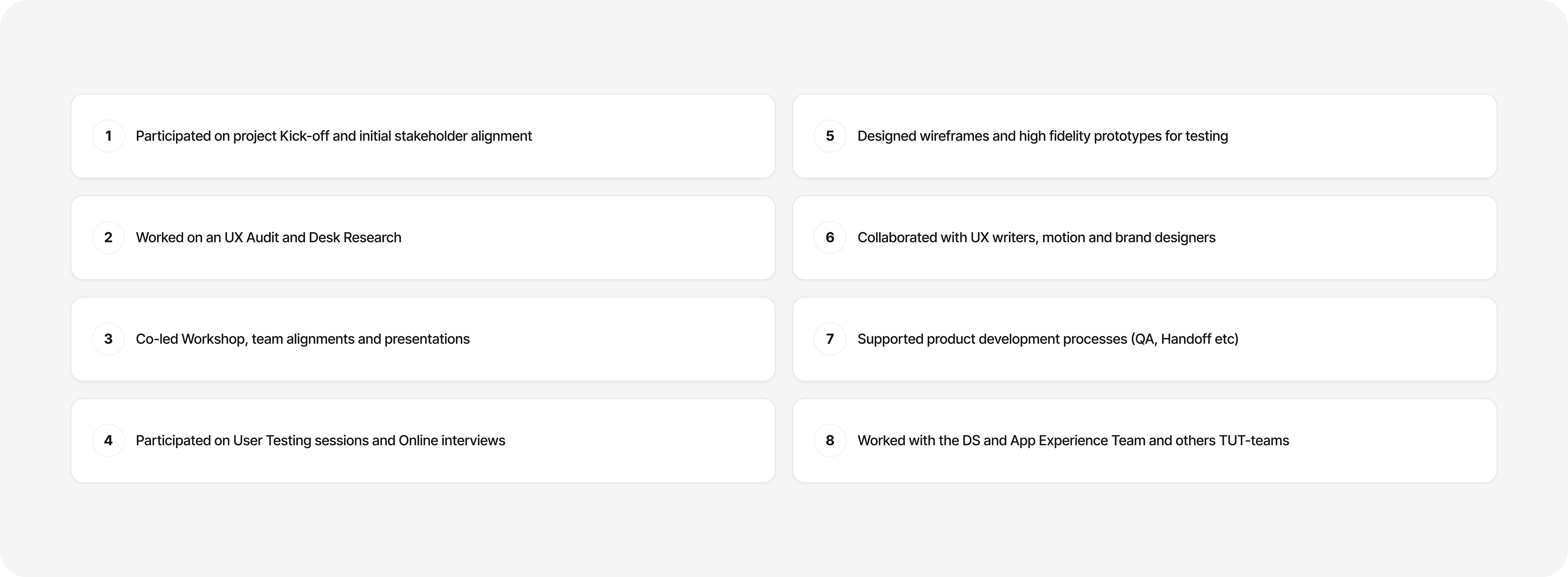
1. UX audit and Desk research: Spotting potential gaps in the experience.
2. Wireframes & Prototype - Mobile: iOS first-approach.
3. User interview and Testing: Gathering more qualitative data and test out mobile hi-fi prototype.
4. A/B testing: Definition of metrics to be followed and preparing documentation.
5. Follow up - Desktop rollout: Implemented after A/B testing results.
Role - Senior User Interaction Designer
Responsibilities
Tools and Techniques
1. UX audit and Desk research
2. Workshops and Team alignments
3. User interview and Testing
4. A/B testing
2. Workshops and Team alignments
3. User interview and Testing
4. A/B testing
1. UX audit and Desk research: Identified areas for improvement in the current version and conducted desk research to gather existing insights and industry best practices.
2. Workshops and Team alignments: Co-led sessions with stakeholders and developers to strategize the MVP, assess design feasibility, and gather continuous feedback
3. User interview and Testing: Validated our design approach through testing before development.
4. A/B testing: This approach provided quantitative insights into user preferences and behaviors, ensuring informed decisions for optimizing the user experience before full release.
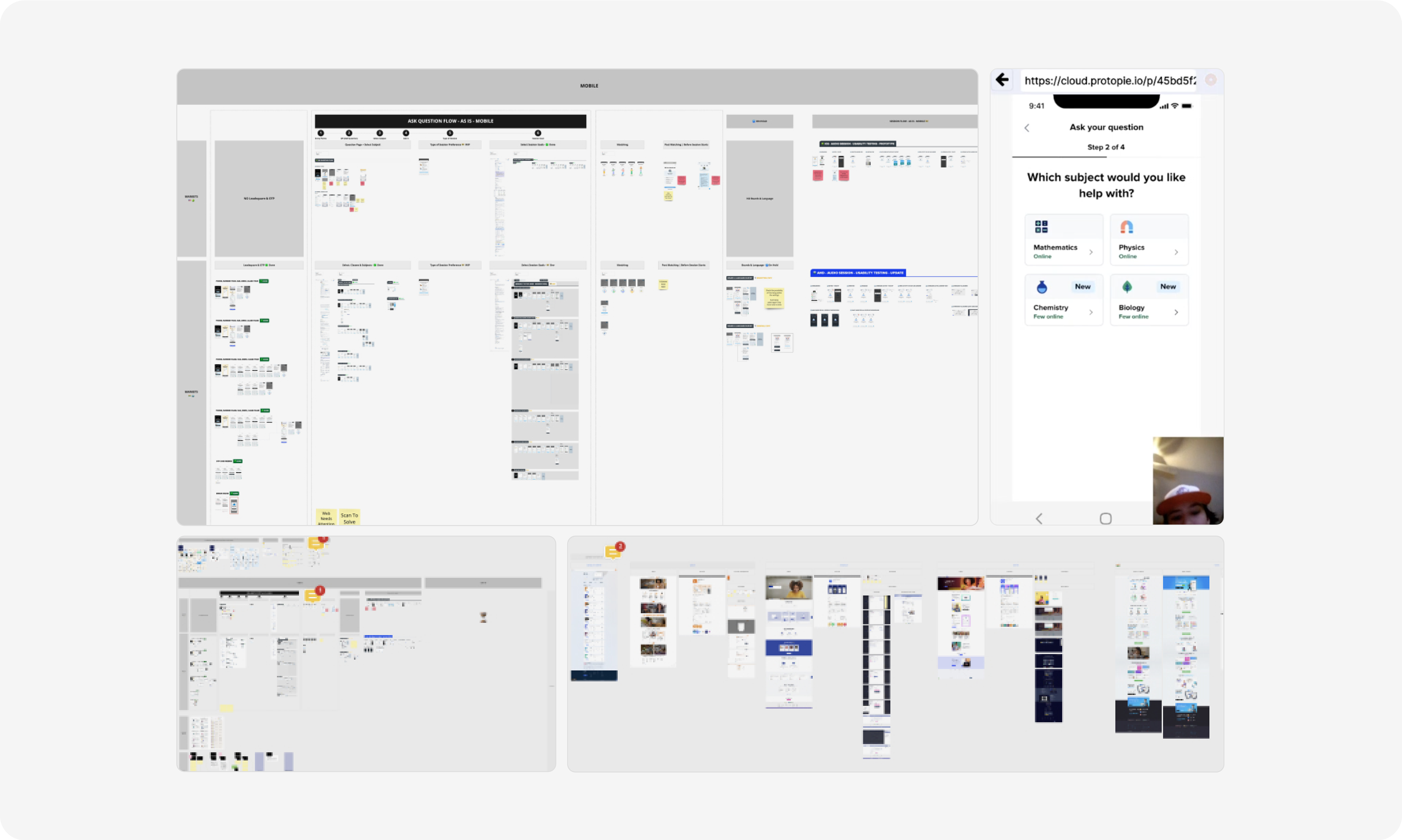
Wireframes - We had a team session to gather some early feedback
1. Too many steps
2. Abrupt changes vs current version
3. Adding too many new features would slowdown implementation
2. Abrupt changes vs current version
3. Adding too many new features would slowdown implementation
1. Too many steps: The feedback pushed us in a good way to simplify the number of steps that the first version had.
2. Abrupt changes vs current version: A heavy change on its logic, could create more friction.
2. Abrupt changes vs current version: A heavy change on its logic, could create more friction.
3. Adding too many new features would slowdown implementation:
E.g. Adding instructions for each step or adding a new Search component.
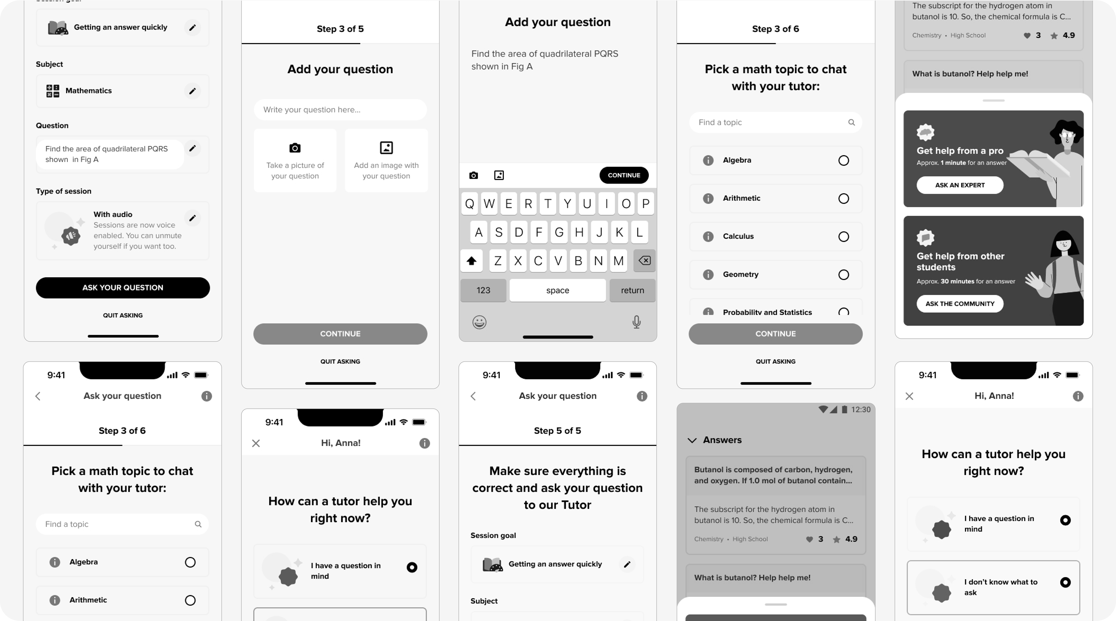
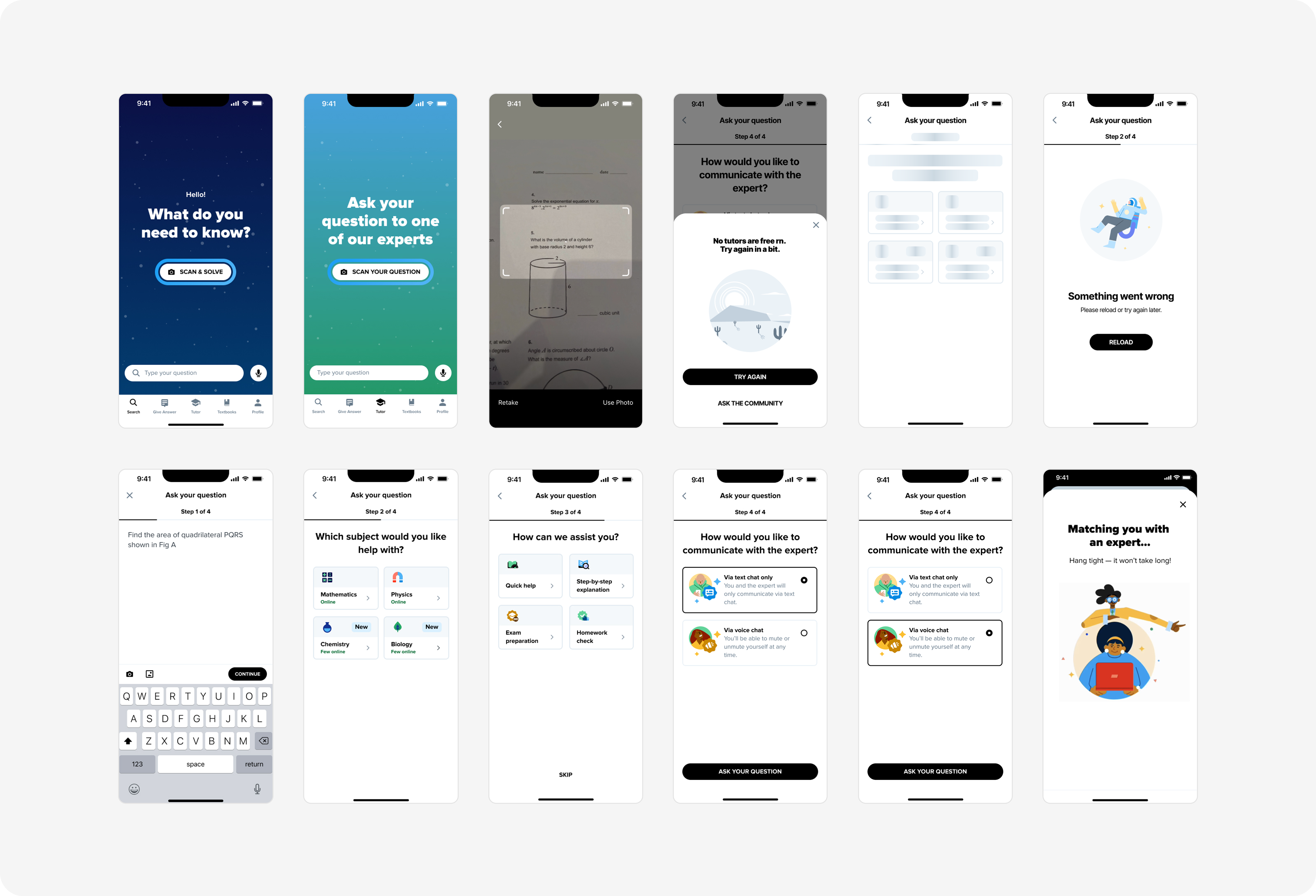
Prototypes - User Testing
1. Flow redesign
2. UI and illustrations updates
3. UX writing update
4. Testing potential future improvements
2. UI and illustrations updates
3. UX writing update
4. Testing potential future improvements
• 10 Moderated tests
• Tested with school-aged students based in the US
• Prototype A: Recurring Users
• Prototype B: First-time Users
1. Flow redesign: Testing a quicker approach with a potentially more efficient flow displayed within a visible timeline.
2. UI and illustrations update: Introduced a "clean" aesthetic and emphasized diversity in visual elements.
3. UX writing update: Aligned the UX writing with the new company guidelines for a more consistent voice.
4. Testing potential future improvements: For example, by exploring additional tutoring session formats, such as asynchronous learning.
Process & Collaboration
1. What didn’t worked well this time
• ‘Help me picking a question’ (potential new feature) and Async sessions: Overall users didn’t demonstrated any significant interest in these features. Further investigation can be done in the future, if deeper focus on them.
2. What worked well this time
• Clear timeline structure: Users appreciated the clear structure of steps and preferred the way information was organized in the new flow.
• New visual elements: Users praised the new illustrations for their emphasis on diversity and inclusion.
• Asking questions via images (OCR): Users highlighted the importance of this feature, recognizing it as a core part of the Brainly product and expressing the need for it to be included within Tutoring too.
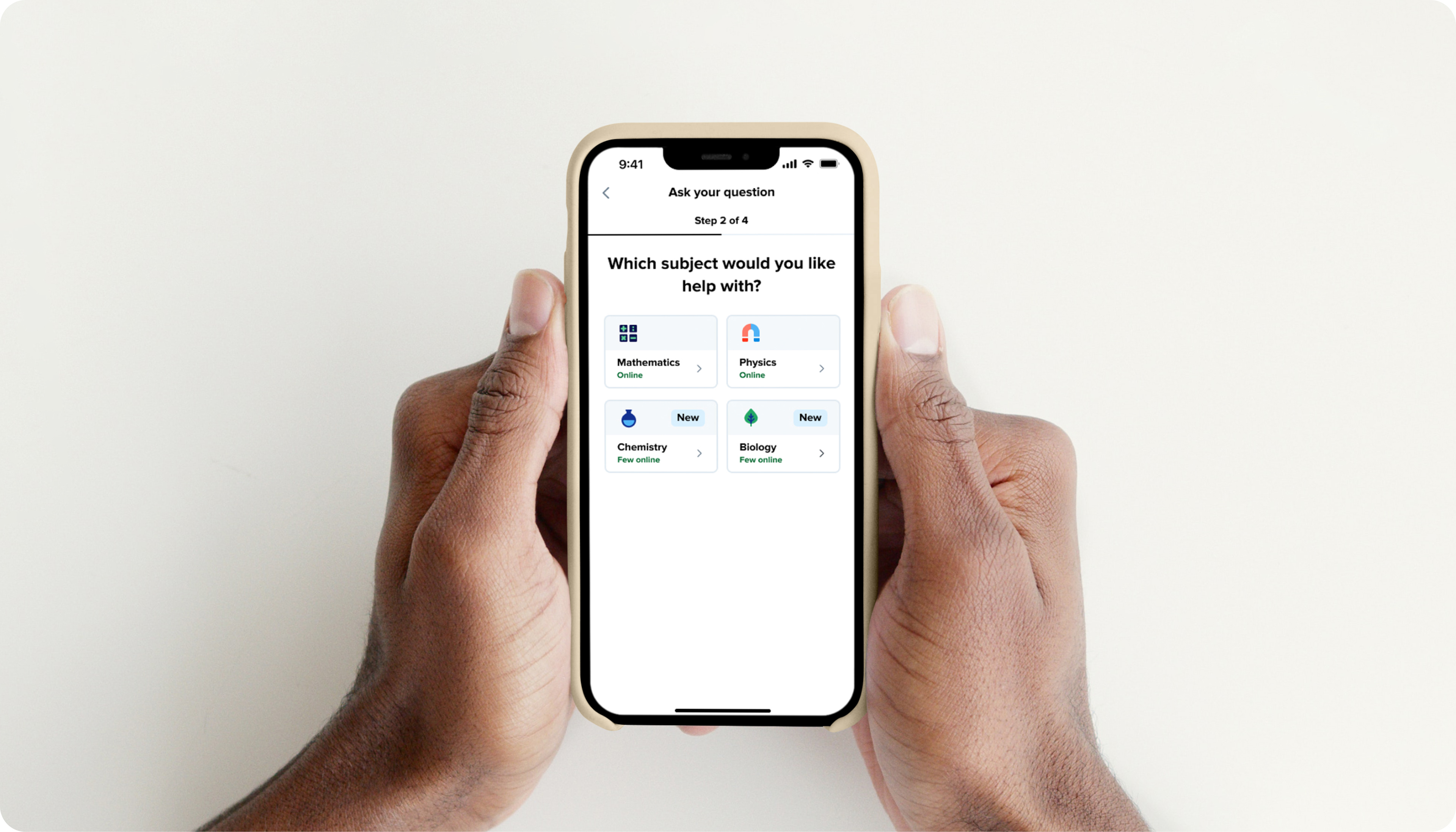
Designs
Ready for development
Learnings
1. What did I learn or love in this project?
• Collaborating across departments: Coordinating with multiple teams, including writers, branding, and motion, significantly elevated the project's outcome.
• Ongoing developer involvement: Initial sessions with developers were crucial for assessing the feasibility of our solutions early on, allowing us to pivot when necessary.
• User interviews and Testing: Our user interviews and testing greatly influenced our considerations, helping us prioritize and identify areas for further investigation in future iterations.
2. What could have been done differently?
• Some clearer alignment with stakeholders: Specially in regards to our research and ideation phase could have minimized excessive back-and-forth communication.
• Perhaps testing less features at once: Stakeholders strongly advocated for testing multiple features simultaneously. They yielded inconclusive results and required further investigation.
• Long process of recruitment for user tests: The recruitment process was lengthy and challenging due to the complexity of our tool and the difficulty of finding suitable teen participants. These factors significantly slowed down our testing timeline.